It’s You Tube Tuesday!
Did you know that Stampin’ Up! posts videos of new products on their YouTube channel?

Every Tuesday, I’m going to highlight one video — a new product spotlight, a technique, or how to use something.
This week, I want to share a video from Stampin’ Up! that shows the new Designer Series Papers in the new 2017-2018 Annual Catalog. Look at the beautiful artwork — and what about those vibrant, new In Colors?!? I LOVE the new colors! Take a look:
Designer Series Paper
We all know that the little swatches in the catalog don’t show the detail or quality of the papers. In addition to that, there are some interesting things in these papers that I want to bring to your attention.
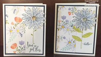
Delightful Daisy Designer Series Paper:
This paper is absolutely gorgeous! Every sheet is prettier than the next, and I’m loving that I can pull out my Calypso Coral ink and card stock again.
It’s so pretty that it’s a shame to cover it up with additional layers!
 Just Add Color Designer Series Paper:
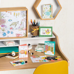
Are you a fan of the new adult coloring trend? This paper is for you! The double-sided paper is a heavier weight, so it will hold up to watercoloring with Aqua Painters, Blender Pens, or whatever your coloring medium of choice is. All of the papers in this photo were originally black & white…!
Bundle of Love Specialty Designer Series Paper:
If you just looked at the name of this paper, you’d probably figure that it’s “baby” paper, and you’d be sort of right.
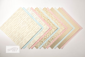
Each piece of paper in this pack is vanilla/blue or vanilla/pink — on one side. But it’s double-sided, so if you don’t need, say, the pink side, you’ve got a sophisticated gold foil pattern on the other side.
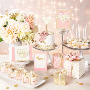
Does this look like it’s “just baby paper” to you?
And finally…
When you’re looking at the Designer Series Papers in the catalog, you should also note that there’s a coordinating card stock pack to go with each package. For just $8.00, you’ll get 3 colors of card stock, so you know you’ve got just the right color to go with all of the different patterned papers in the DSP. It’s genius! 🙂
Take another look at all of the papers here:
|
|
|
||
For a better look at the fun Eastern Palace Specialty Designer Series Paper, take a look at this post.
Follow me this week on Instagram and Facebook to see more samples using the Designer Series Paper!
How To Easily Make a Layered Look using Faux Tearing
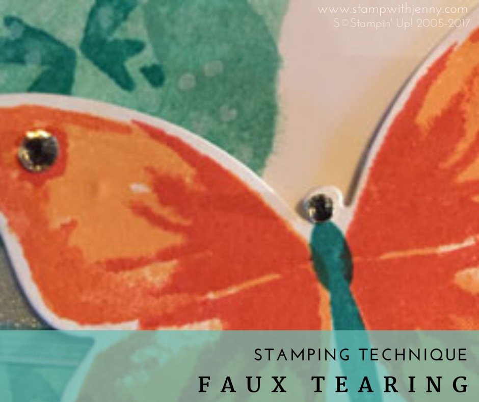
Sometimes when you’re making a card, you want to add another layer to give it a little something extra… but what do you do if you need to keep the bulk down so you can mail it?
Let me introduce you to one of the very first techniques I learned when I started stamping 14 years ago:
Faux Tearing
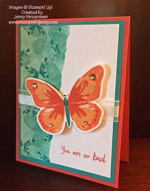
Faux tearing is exactly what it sounds like. You’re creating the look of a layer of torn card stock without the added weight.
And it’s remarkably easy to do! All you need is a piece of card stock for stamping, any ink pad, a Stamping Sponge, a piece of scrap paper, a piece of grid paper to stamp on, and a scrap piece of washi tape.
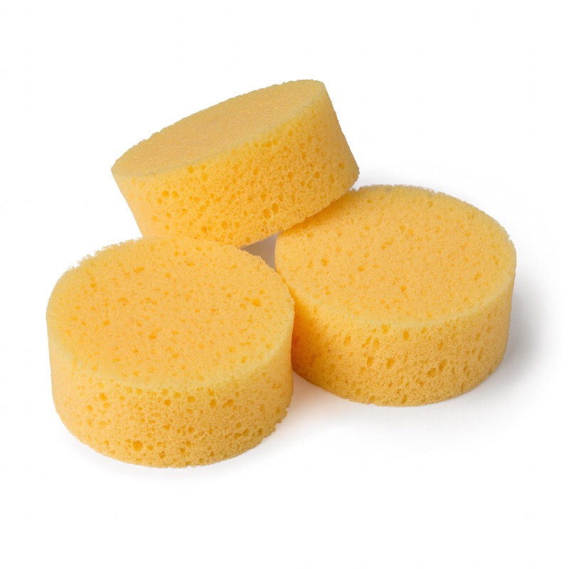
(Tip: before using your Stamping Sponges, use your Paper Snips or other craft scissors to cut them into sixths — cut the sponge in half, then cut each half into thirds. The smaller pieces make it easier to control where you’re putting the ink, and you get more wear out of each sponge.)
How To Faux Tear:
- After making sure your scrap paper is longer than the “tear line” you want to create, tear down the length of the scrap paper to create an uneven, torn edge.
- Place your card stock on the grid paper so your work surface is protected. Lay the scrap paper down on your card stock with the torn edge where you’re going to ink. Place a small piece of washi tape on the opposite (straight) edge of the paper from where you tore it to hold it still against the cardstock.
- Sponge the ink onto the exposed half of the card stock, up and down the torn edge of the paper, and working your way across to the edge of the card stock. Continue adding ink until you get the coverage you want.
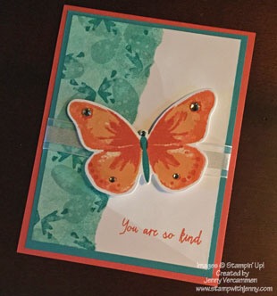
- If you want to add more depth, you can create a background on this stamped area like I did on the butterfly card. Without removing the scrap paper, I used the same color ink to stamp the solid butterflies. Then I added the smaller butterflies with a slightly darker, coordinating ink, making sure that I stamped the butterflies off the edges of the card stock and back over the torn edge of the scrap paper.
- When you’ve finished stamping, give the ink a little time to completely dry so you don’t smudge it. Then remove the washi tape and the scrap paper. You should see a distinct line where you stopped your stamping.
- Now your layer is ready to be embellished and finished!
|
|
|||
|
|
|
|
|
|
|
|
I hope you’ll give this classic technique a try!


